Adobe Illustrator CC Tutorial: How to create a flat illustration + Free Download
bhadra 0 Comments Illustrator
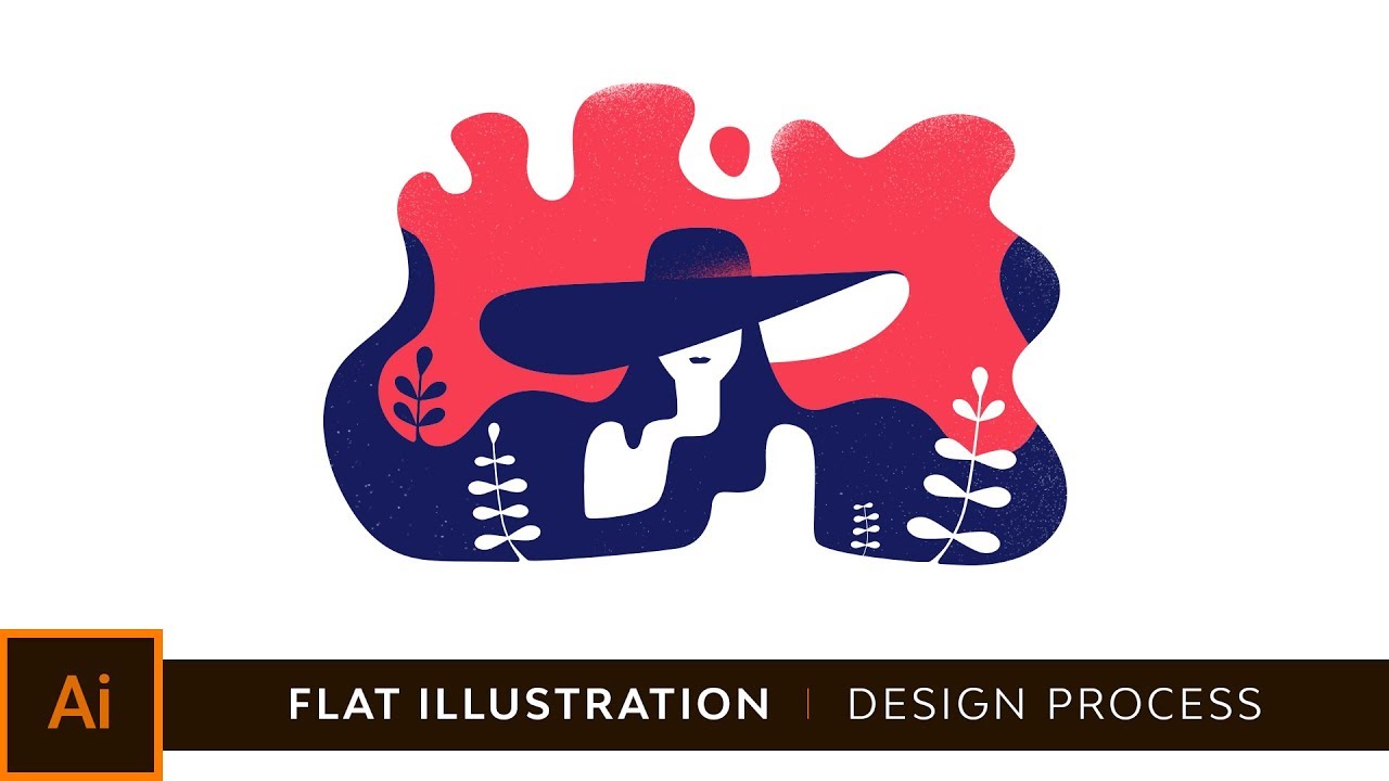
I was planning on doing a small illustration, the previous screen was the inspiration I gathered from dribbble and that got me, that let me in the mood of trying something similar, a very minimal illustration with maybe two colors and some use of negative space so this is the sketch I did, now I did it real quick trying to figure out the whole idea I wanted to have someone with a summer hat on and somehow blend in with with the background, with the background shape so this was the second, the second variation of that initial sketch and even though I I like I like it it feels kind of flat so I tried I tried to tighten it up and give it more, give it more personality even though the main goal was to have the hat be the be the main point of focus, I wanted to have a sun and maybe the sea behind, but yeah I wasn’t sure about it so I started doing multiple variations and in the end ended up with this one. Now let’s move over to illustrator where I just placed this image, now I’ll lower its opacity and lock this layer up so I can trace over it and not have to worry about accidentally moving it, so let’s just zoom in and I can start actually start tracing the image using the pen tool Even though my curves are looking good I just used the smooth tool you can find it there and I just go over every single line and it will smooth it out as you can see right here that curve is not is that perfect so what I do I just click and drag on top of it and it’s going to smooth it out it’s going to add more anchors and it’s going to make it look more natural.
I slowed down the video here just to show you how I used the round circle to create the face outline I will be adding a couple of anchors and adjust it a bit to give it more personality but this is the face for now. Whenever I want to have consistent round corners somewhere I just draw straight lines, straight 90 degrees angles and then I just direct click on the anchor and drag using that small circle. At this point I don’t really like the illustration and how it looks just because it looked everything looks so even and symmetrical so I start adding paths with different colors for this example with white just to give it an unsymmetrical look just to give it more personality.
It’s good from time to time to just zoom out and see what gets your attention and focus on that, for example for this one the shoulders seem kinda uneven, I have way too much negative space on the right hand side so I just wanted to add a couple of more volume for the hair to cover it up. I would also like to mention that from time to time it’s great to just reflect the whole illustration and see what stands out, for example when I did this I saw that those those top elements were way too big for the whole illustration so I just started drawing over them and adjusting those lines. Since we’re at the end of the process I just selected the two color schemes I liked the most and once I place it on top of the sketch I’ll just remove the initial sketch from the background just so I can focus on color and I wanted to experiment a bit with something more contrasting that will replace this light blue, just because with this light blue the the negative space doesn’t really, doesn’t really stand out so I just tried maybe getting something lighter or maybe getting something like a red and in the end I feel like using red is so, is looking so much better.
Now I’ve selected inside Photoshop an airbrush with that has grains just to try and see if I can give it more volume just using white and of course I have a Wacom tablet but you can do this with the mouse as well and just add a couple of speckles to give it more volume. This is the final illustration.
Read More: Everything Else in 3.0 (Adobe Character Animator Tutorial)
Posted in Illustrator


