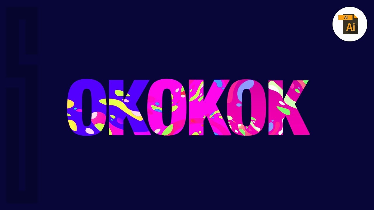
ILLUSTRATOR TYPOGRAPHY ART Using Abstract Shapes
bhadra 0 Comments Illustrator
in today's video we have a quick
illustrator tutorial on how to design some funky fresh typography in 2019
we're going to utilize abstract shapes and some nifty techniques for the final
typographic solution it's actually easier than you think so welcome back to
Satori graphics and we're delving deep into Adobe Illustrator once more for
today's of funky fresh typography design now because it's
typography we obviously need some text so go ahead and press T for the type
tool and then generate out your text it is wise to choose a thick and a bold
font and I personally gone for Helvetica black for maximum thickness but once you
have your texts you can move it off to one side as we're going to use that
later now choose a background color for your
design in the color palette and you can choose whatever floats your boat
but I'm electing for a deep blue almost purple color for my design now press M
for the rectangle tool and then draw out an area on your artboard you can click
your rectangle and then press command a two on a Mac or ctrl two on a PC as this
is gonna lock it down in place this just makes things easier for us when we're
creating a design today we're now going to utilize the curvature tool to make
the shapes for the next step in today's typography tutorial now this is a lot
easier to use than the pen tool for shapes of this nature you just click in
the general direction that you want to go and illustrator is going to generate
perfect curves as you go it's that simple really so once you have your shape click the
gradient in the color palette situated in the bottom left on your screen and
then apply your gradient choosing the colors that you want to use now one more
time I'm going to make another quick shape here following the shape style and
direction using the curvature tool I'm going to show you how to tidy up the
shapes in a moment but you can always press a for the direct selection tool
and then manipulate the anchor points and the handles around the shape but for
an easy and a quick smooth adjustment go ahead and choose the smooth tool located
here now just click the anchor points what click and drag around a vector path
and in doing so your shape will smoothen out before your very eyes I'm now going
to show you a really neat technique that is great for digital illustrations as
what is the current typography design that we're making now if I have to
abstract looking shapes here I can select both of them and then open up the
Pathfinder window in the Pathfinder window I'm going to
utilize the divide function now this cuts the shapes along the overlapping
vector paths and I can actually then ungroup the divider selection and remove
unwanted areas this leaves me with a crisp and a clean cut out shape for my
design and you can have lots of fun with this technique on your own design now
I've added a dark background to the artboard with the rectangle tool and I
also finished off my abstract shape creations we're now ready to make the
actual tab or key section in the process we're going to use a clipping mask so
bring the text to the front of all layers and then in the Pathfinder window
convert your text to a compound shape this is going to allow us to change the
actual wording after the effect has been applied now bring your text over on to
your design and adjust the scale by holding down shift and then clicking and
dragging we can actually change the layout later so I have some neat tips to
show you but for now just try to cover your design properly with it text now my
background layer is in fact locked but the blue one is unlocked and I did that
by unlocking them here in the top drop down menu or you can use the keyboard
shortcut now select all relevant layers and then right or ctrl click the
selection you then just choose a clipping mask and as you can see that
looks pretty neat but what if you're not happy with the layout of your design
well and go ahead and open up the layers window and then you can select specific
design objects by clicking the blue button and then just adjust and move
them around as you see fit the clipping mask effects will still be
applied to your design and typography because the text is a compound shape you
can also change the wording to now it's going to help if you name the layers in
the layers window that's something I didn't do today but it's nice Angela
it's just helpful you can use these techniques and these tips that I've
shown you in today's video to create some awesome and some funky typography
in Illustrator abstract shapes are a kind of trending topic in 2019 when it
comes to graphic design so explore this technique and abstract shapes to make
your very own designs if you're not completely clear on today's tutorial or
you're not sure about certain aspects go back and watch the video again or you
can bookmark it to watch it later also don't forget to like and share my
content on social media and if you want to keep boosting your skills and your
awareness as a graphic designer make sure to subscribe to my channel for
weekly graphic design content have a great day and until next time design
your future today peace you